
Using a card as a slicer in Power BI is a common question I receive. The quick answer is it is not possible – I hear this much too often from others. However, that is a very rare statement I would make about Power BI. It is a rare statement that I use with anything data related. I feel like so much more is possible if you think outside of the box. Too many people stop when they cannot find the answer they were looking for.
I will add a quick posting to show a couple of options on how to work around this “issue”.
- A customized bar or column chart
Pro(s): standard chart, looks like a standard card
Con(s): the bar would only look transparent if your background is a solid color, requires re-sizing for larger data labels
Customization: add the KPI, add the attribute you want to slice by on the axis, use visual filters if necessary, turn off x and y axis, turn bar color to the same color as your background color, turn on data labels with placement centered inside of bar
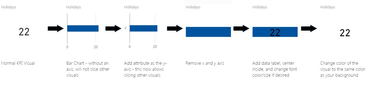
You can’t even tell the difference between the original KPI visual and the bar chart!
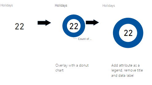
- A donut chart overlaying a KPI visual
Pro(s): standard chart, looks clean
Con(s): have to click on the donut, cannot click inside of the donut, requires proper sizing of the overlay for largest number expected in the KPI
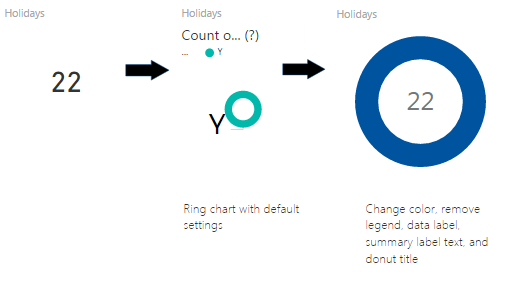
- Custom visual ‘Ring Chart’
Pro(s): easy, looks like donut chart option above but should be cleaner for variable measure lengths, etc.
Con(s): non-standard chart
Well done,I wouldn’t have even thought of the problem let alone the solution esp the Bar Char work around!
Thanks Rory!
This has been a life saver! One thing to add that was driving me crazy is you have to make it unresponsive under the General formatting section. Then you can make the data label as big as you want. Cheers!
Thanks a lot..was a great help