
Power BI conducted a best visuals contest during the month of September. Now, they have added a large portion of those visuals to a community gallery and added the ability to download and import those into the Power BI online services or Power BI Desktop.
Click here to see our article on people’s choice awards and top three entries.
Power BI allows the development of custom content utilizing Power BI developer tools. Utilizing the tools, developers can code and deploy custom visuals. The existing code for current visuals and other developers’ submissions can be seen on the Power BI GitHub site.
On October 19th, 2015, Microsoft created a community site (visuals.powerbi.com) that allows creators to upload new Power BI visuals and for users to browse, select and download those visuals.
As of now, there is not much in the way of documentation so utilizing some of the visuals is difficult. I will outline my experience with building sample visuals on top of the AdventureWorks 2012 DataWarehouse data. At the end, I will also include the .pbix file with all of the visuals as well as sample reports built on top of the data regarding Sales, Product data, and Customer profiles.
Here is the end result, but afterwards, I will go through each of the visualization types individually.
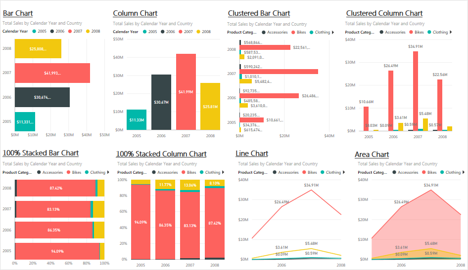
First page of standard visualizations:
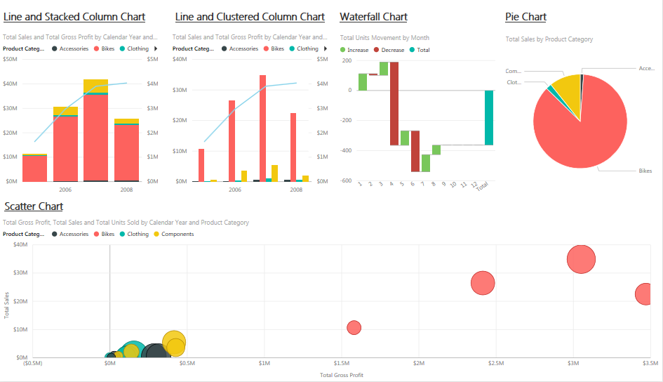
Second page of standard visualizations:
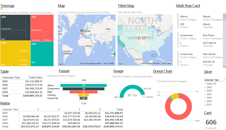
Third page of standard visualizations:
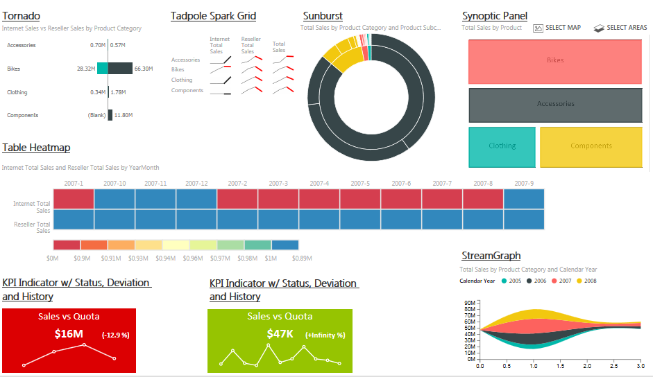
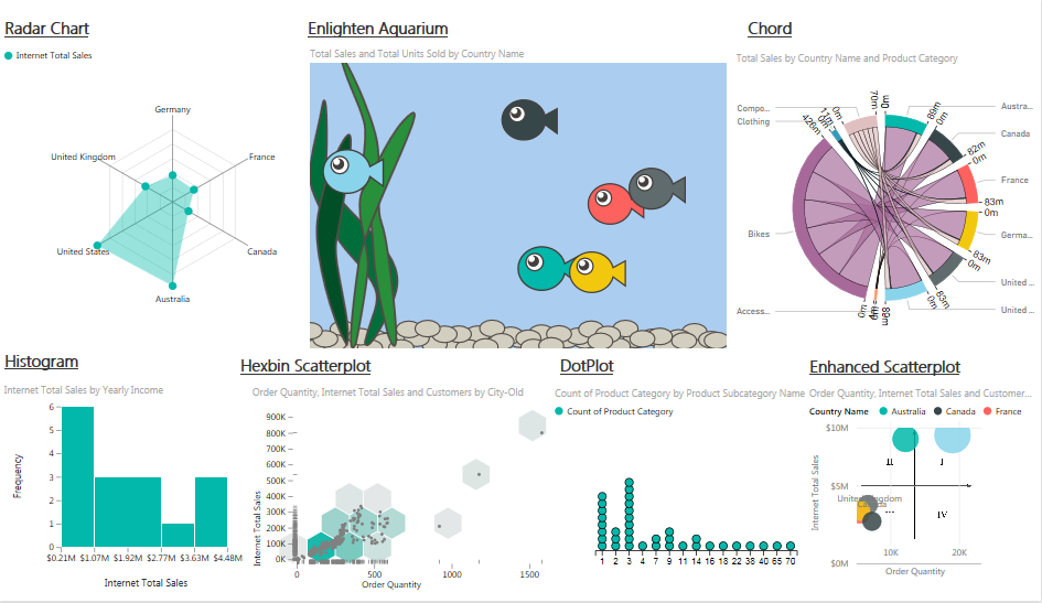
First page of custom visualizations:
Second page of custom visualizations:
Third page of custom visualizations:
Individual Standard Visualizations:
100% Stacked Bar Chart
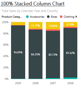
100% Stacked Column Chart
Area Chart:

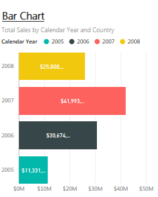
Bar Chart:
Card:

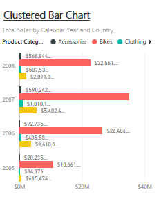
Clustered Bar Chart:
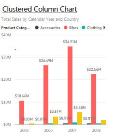
Clustered Column Chart:
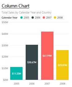
Column Chart:
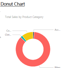
Donut Chart:
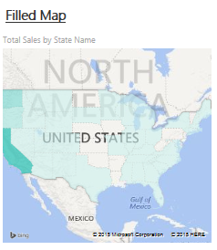
Filled Map:
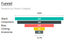
Funnel:
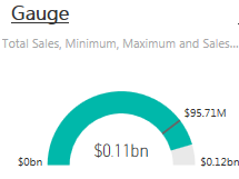
Gauge:
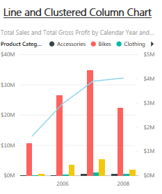
Line and Clustered Column Chart:
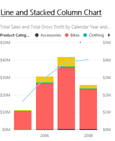
Line and Stacked Column Chart:
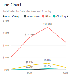
Line Chart:
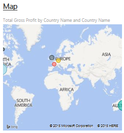
Map:
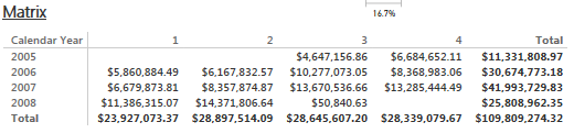
Matrix:
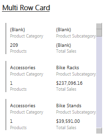
Multi Row Card:
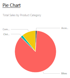
Pie Chart:
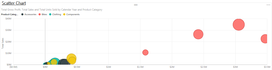
Scatter Chart:
Slicer:
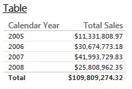
Table:
Treemap:

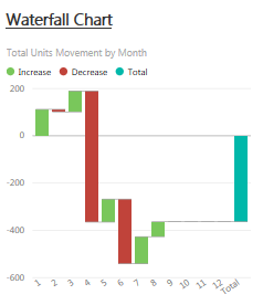
Waterfall Chart:
Individual Custom Visualizations:
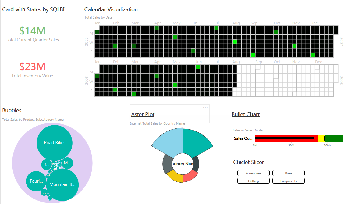
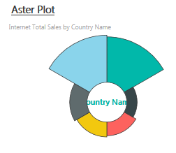
Aster Plot:
Published by Microsoft
An Aster plot is a twist on a standard donut chart, using a second value to drive sweep angle.
In this example, Internet Total Sales by Country is utilized.
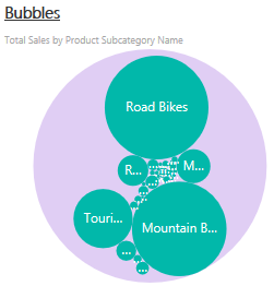
Bubbles:
Published by Dharminder Kumar Dhanda
Bubble chart encodes the data in area of circles. Size of the bubble represents measure and multiple bubble represent dimension attribute.
The original contest entry (here and pictured below) was much better visually than what is currently available. In the current iteration, you are not able to alter individual colors; instead, you are only able to alter the title, label color, or background color. I hope for an update to this soon.

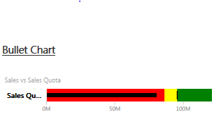
Bullet Chart:
Published by Microsoft
A bullet chart that includes four orientations and a few customization options. Use to feature a single measure against a qualitative range.
First, you have to have a measure that is a target and a measure that is your actual. In this case, I utilized sales quota vs reseller total sales. In order to get your red/yellow/green color scales (colors are able to be customized), you have to have a field/measure for minimum, satisfactory, good, and maximum or enter hard values for each one in the format options. This visualization has many formatting options.
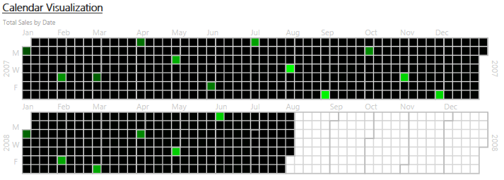
Calendar Visualization:
Published by Elastacloud Limited
Visualize your time series data in an abstract calendar so that you can see heatmap.
As of now, there are no formatting options for this visual. It definitely needs a scale and it would be nice to at least have color options.
Card with States by SQLBI:
Published by SQLBI
Based on the Power BI builtin Card, this visual allows you to bind a performance value and define up to 3 states that determine the color of the main label. Moreover, the category label is fully customizable.
This visualization is nice….a quick look will tell you the state of the measure. Allowing measures for the state thresholds would be a nice touch.

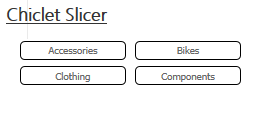
Chiclet Slicer:
Published by Microsoft
Use this slicer to display image and/or text buttons that act as an in-canvas filter. Define additional properties for the layout & selection to customize this slicer to meet your specific needs.
This is great! This is a very enhanced version of the Excel and Power View slicers we are all used to. Added are even more formatting options including colors, borders, layout, and the use of images. This is definitely done right.
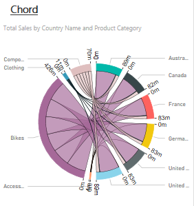
Chord:
Published by Microsoft
A chord diagram is a graphical method of displaying the inter-relationships between data in a matrix.
This is a nice looking visual but does take a moment to understand the data. In this case, it is showing the relationships between product category and country by looking at sales total.
This visualization does not allow drill-down.
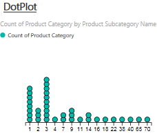
DotPlot:
Published by Microsoft
A dot plot is used to show a representation of the distribution of frequencies. It is most often used to show counts of an occurrence.
This one could use more format options as well….currently, the only options are altering the title and background.
This visualization is filtered appropriately by report/page/visual level filters but does not cross-filter other visualizations if a bucket is selected. This visualization does not allow drill-down.
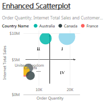
Enhanced Scatterplot:
Published by Microsoft
A few more properties were added to the existing scatter chart visual, including shapes as markers, background image support, and developer crosshairs for positioning elements onto an image background.
This visualization does not allow drill-down.
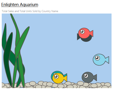
Enlighten Aquarium:
Published by Enlighten Designs
Data should be simple and engaging. Data should tell a story at a glance. Data should be FUN! Enlighten aquarium tells a story through making your data simple, fun and engaging. It can be used in various situations like a dashboard screen in a room where everyone can see it and notice changes day to day and empathise with the data to rally efforts.
Again, the design contest entry had more features like the second measure would be added as another fish shape. As well, it would be nice to be able to drill down on the fish to another level.
It seems as though the Aquarium hover does not work. It shows the first in the list of attributes for each fish but with the correct measure value. This visualization does not allow drill-down.
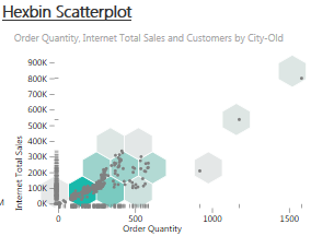
Hexbin ScatterPlot:
Published by David Eldersveld, BlueGranite
The Hexbin Scatterplot from BlueGranite is a variation of the traditional scatterplot that involves clustering points onto a uniform grid of hexagons. Rather than relying on size to indicate differences in values like a bubble chart, the hexbin plot instead uses variation in bin color similar to a heat map. A higher saturation or darker color indicates higher density when working with two measures. A third measure can be added so that the plot colors change from indicating point density to instead encoding the value of the third measure. Bin radius can also be adjusted.
This visualization has nice formatting options including the color and size of the hexbins, title and background, and whether to show the dots, the hexbins, or the rug.
The hover over of this visualization does not provide any valuable data. For the value in the ‘Value’ field, it seems like it should provide meaningful data (i.e. mean/median/min/max value) but does not….instead showing the same value for each. This visualization does not allow drill-down…..it does filter data but not at the hex level, instead at the plot point level.
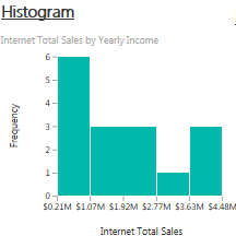
Histogram:
Published by Microsoft
A histogram chart plots data ranges into intervals. Useful for estimating density.
You are able to specify the number of buckets but it would be a nice addition to allow for custom sizing of the buckets. As well, it would be nice to show a legend showing the scale of each bucket and different colors for each bucket.
This visualization is filtered appropriately by report/page/visual level filters but does not cross-filter other visualizations if a bucket is selected.
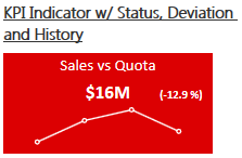
KPI Indicator with Status, Deviation, and History:
Published by Fredrik Hedenström
This visualization is all about visualizing Key Performance Indicators. The status is presented as a color indication, comparing the actual and target values. Deviation is presented as distance in percent of actual from target. The history (trend) is presented as a line or a bar chart. It is up to the user to decide the granularity of the data displayed. Any dimension attributes can be used, but it’s recommended to stick to the ones in your date dimension.
This incorporates one of the best features of Datazen into Power BI. This makes it very easy to see the status of a KPI as well as the history of the measure. Improvements could be made to not require text entry for each of the General formatting options. For example,
Banding Type (IIB, DIB, or CIB) looks to specify whether an increase is good or bad and show green or red accordingly.
Banding compare type (ABS or REL) looks to round the deviation if REL is entered while ABS shows the true deviation number to all decimal places (typically, not preferred and takes up real estate).
Chart type (LINE or BAR) shows the measure history as a line chart or a bar chart.
These should all be drop down selectors with more understandable options.
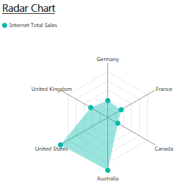
Radar Chart:
Published by Microsoft
A simple radar chart supporting multiple measures plotted over a categorical axis. Also known as a web chart, spider chart, or star chart. Use to display performance metrics for quality improvement.
You need a little real estate for this one to be visually appealing or useful. The only formatting options are title and background. Adding the ability to change colors would be a nice addition.
This visualization is filtered appropriately by report/page/visual level filters but does not cross-filter other visualizations if a bucket is selected. This visualization does not allow drill-down.
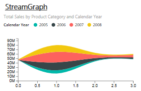
StreamGraph:
Published by Microsoft
A stacked area chart with smooth interpolation. Often used to display values over time.
This visualization does not have hover over information and it would be nice to have the category as the x-axis to make more sense.
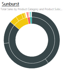
Sunburst:
Published by Microsoft
Sunburst is a multilevel donut chart, used to visualize hierarchical data, depicted by concentric circles.
The only formatting options are title and background. Adding the ability to change colors and possibly size of each level would be a nice addition.
Synoptic Panel:
Published by SQLBI
The Synoptic Panel connects areas in a picture with attributes in the data model, coloring each area with a state (red/yellow/green) or with a saturation of a color related to the value of a measure. Starting from any image, you draw custom areas using http://synoptic.design/, which generates a JSON file you import in the Synoptic Panel. You can visualize data over a map, a planimetry, a diagram, a flow chart….
I started with a much more difficult synoptic panel (map of the United States in order to create regions) but the tool was not very conducive to non-linear areas (or I was too impatient). Therefore, I went with a very simple example of squares aligned to product category. Again, a great visualization and adds lots of capability when thinking about utilizing portions images to drive filtering (see @5h15h‘s example in his tweet). This visualization includes lots of great formatting options. My only suggestion would be the allowance of measures for saturation.
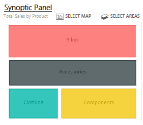
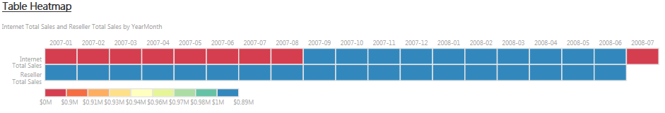
Table Heatmap:
Published by Galiya Warrier
You can use this custom visual to build a table heat map that can be used to visualise and compare data values in an easy and intuitive way. You have a built-in option within this visual to specify the number of buckets used for splitting your data. Additionally, you can also customise it by choosing a colour scheme in line with your brand colours.
Another great visualization but limited on formatting options (title, background, colors, and number of buckets). Again with this visualization, in order to see column headers and buckets, you need more real estate for this visual. The entry of colors is text based and I had to go to the contest entry page to get the variable options for both colors and buckets:
– Available color schemes options:
“Purples”, “Blues”, “Greens”, “Oranges”, “Reds”, “Greys”, “YlGn” (Yellow-Green), “GnBu” (Green-Blue), “BuGn” (Blue-Green), “PuBu” (Purple-Blue), “BuPu” (Blue-Purple), “RdPu” (Red-Purple), “PuRd” (Purple-Red), “OrRd” (Orange-Red),
“PuOr” (Purple-Orange), “BrBG”, “PRGn”, “PiYG”, “RdBu”, “RdGy”, “RdYlBu”, “Spectral”, “RdYlGn”, “Paired”, “Pastel1”, “Pastel2”
– Accepted value for number of buckets: 3,4,5,6,7,8,9
This visualization is filtered appropriately by report/page/visual level filters but does not cross-filter other visualizations if a bucket is selected.
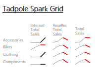
Tadpole Spark Grid:
Published by Angry Koala Pty Ltd
This visualization draws a grid (using Matrix data) of spark lines which have a particular color scheme. Each line segment represents a period (such as month) and a measure value. The line segments are colored (black-positive) and (red-negative) based on a comparison of the current period value with the previous period value. Usually up for positive and down for negative. There are 2 toggle switches in the visualization, one called “less is good” will switch the negative and positive tests making down good. The other toggle “overlay mode” can take two measures such as last period and current period or budget and actual and overlay the two. The first measure will be in light grey and the second measure will be colored based on the comparison between the two measures rather than just the previous period. In order for this visualization to work correctly, the time dimensions must be the last place in the list of dimensions.
This visualization provides historical sparklines in a matrix style grid….pretty cool. Again limited on formatting options (title, background, and less is good/bad to change red/grey color when increasing/decreasing) and it would be nice for options for colors or layout options (i.e. moving columns to rows nested under categories).
This visualization is filtered appropriately by report/page/visual level filters but does not cross-filter other visualizations if a bucket is selected.
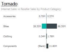
Tornado:
Published by Microsoft
A bar chart with category values listed vertically. Use for comparing the relative importance of a variable between two distinct groups.
Another great visualization from Microsoft with a good set of formatting options. For this visualization, you compare two measures against one dimension. Add one dimension to the Group field and two measures to the Values field.
This visualization is filtered appropriately by report/page/visual level filters but does not cross-filter other visualizations if a bucket is selected.
Again, I am hoping for documentation to be added to the visual gallery. Hopefully, this will help you get started on using these. Examples are in this sample .pbix file using AdventureWorks data: download.
I am also interested in how they will handle updates to the code. Will Microsoft take over the development of some of these or will the community add to the base code as needed? Who has the final say in what feature is added? It is interesting to think through. Will users of the custom visualizations be notified if their .pbix file contains custom visualizations and there is an update available?
Also, if anyone from Microsoft reads this, don’t make users enable custom visualizations each time they go away from a published report on powerbi.com and come back to it…..minor nuisance but still a nuisance.
Thanks for posting this overview along with commentary on many of the custom visuals. With regard to some of your questions at the end, I may be able to help shed some light on the process for the non-Microsoft custom visuals.
Microsoft will not take over development of custom visuals. It’s up to the developer to maintain and update the visual–if they choose to. With open source software in general and the Visual Gallery in particular, there’s no obligation to continue work. Gallery submissions require a support URL and email, but that does not guarantee support. Most visuals are public on Github and licensed in such a way where if the visual were ever abandoned by the original developer though, updates could be carried out by the community if needed. Documentation falls in the same line. It’s on the developer to develop documentation and publish it to their support URL. I don’t think we will see standardized documentation for everything in the gallery.
Right now, visuals are submitted via email, but there should be a site available to developers soon to more easily publish upgrades. Microsoft has final say on whether the visuals overall are added based on an initial review of the code. I would imagine that process would continue for updates. Microsoft did not have any input on individual features or format options within a visual though. Everything you see (or don’t see) comes from the developer. For example, format options like color, etc. may not be present because the developer did not include it.
For developers, the custom visual documentation that Microsoft has published is good, but it’s not comprehensive. There is still a lot that a developer needs to figure out, which takes time. As documentation is added on how to create visuals, and perhaps as the community chips in with knowledge over time, I would expect the quality of visuals and availability of format options to increase.
Thank you for the comment David…and for reading the article. I would think Microsoft would want to work with some developers in order to take over the development and enhance them even further…..to essentially make a custom visualization a “standard”. I would also think that in order to submit a custom visual, there should be some set of minimum standards to follow….i.e. titles, background, formatting color options, etc.
I did see support contacts for each that would email the developer but I did not see links to the support documentation.
Regardless, the work the community did on these and the openness of the application is exciting. I cannot wait for what’s next!
Hi there,
Why there is no pbix files in the entire Microsoft websites?
all we see (include this page) is nice pictures or videos but no actual files so we can learn from
Thanks,
Ed Dror
Hey Oded, Microsoft has posted some to the community – Power BI Showcase here: http://community.powerbi.com/t5/Power-BI-Showcase/bd-p/PBIShowcase
I agree that there should be more available with different resolutions in each to learn from. I will do a posting in the near future of all of the resources I have seen.
There is also a great tips and tricks article from Jen Underwood with an example pbix file to download: http://www.jenunderwood.com/2015/11/06/power-bi-desktop-tips-tricks/
Thanks for the good article, I was searching for details like this, going to check out the other posts.